The visual identity was applied across a range of collaterals, including posters, social media, and event-specific creatives.
The system was designed to stay flexible, allowing each output to feel distinct while still belonging to the same identity. Typography, colour, and graphic elements were adapted based on the context, helping the visuals stay dynamic without losing consistency.
Across applications, the balance between structure and playfulness was maintained, ensuring the identity felt both cohesive and expressive at every touchpoint.
Application
004


003
The identity balances expressive visuals with a structured system to keep everything consistent.
The typography is split by role. While the logo uses varied styles for visual impact, the rest of the identity sticks to a clear type system.
The colour palette stays flexible, built from near-primary hues.
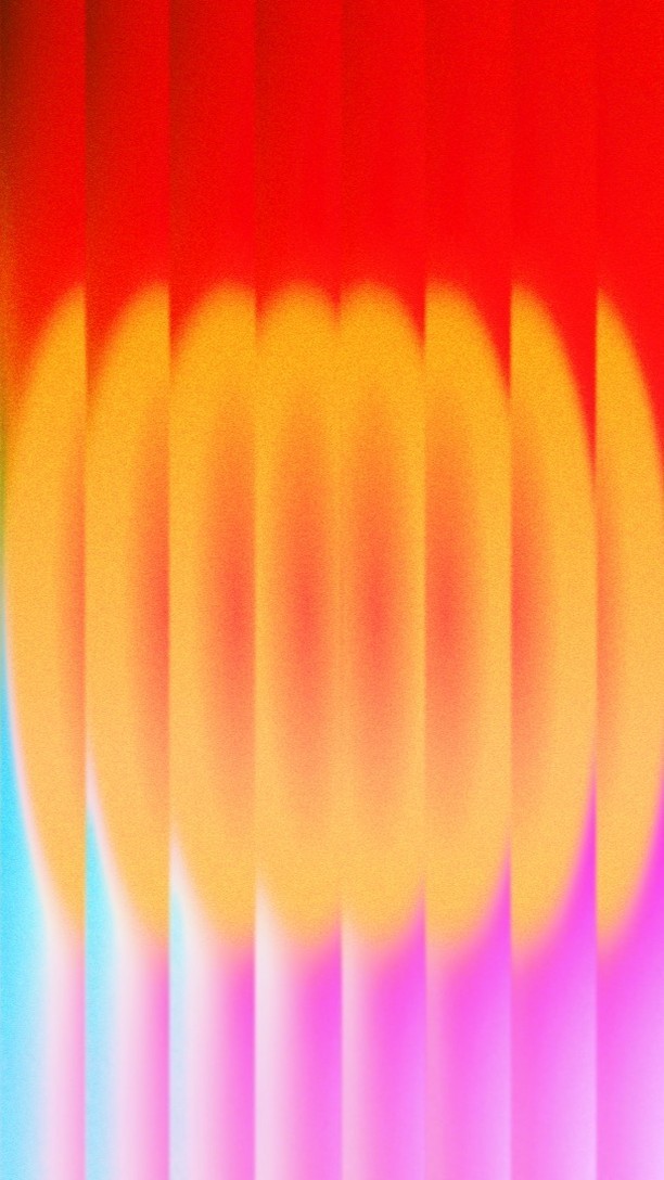
The graphic language leans on playful, textured elements that add energy without relying too heavily on literal representations.
Visual System
#C271AE
#F9D14C
#EB4436
#EB4436
#0DBAB4
#1B1C1C
#FFFFFF
Illustrative elements

Spectrum - NIFT's annual Fest

NIFT Jodhpur Spectrum 2025 - Theme


001
I designed the full visual identity for my college fest, themed around “Synesthesia” ; a concept where senses blend and trigger one another. The challenge was to translate an intangible sensory experience into a structured visual system that could scale across multiple platforms and formats.
Brief
002
Instead of treating Synesthesia as random bursts of colour, I approached it as a system of layered sensory experiences, where different senses overlap and interact visually.
The identity is built on the idea of variety within unity, bringing together diverse elements into a cohesive whole. This is reflected in the logo, where multiple typographic styles merge to form a single, unified mark.
Concept
Logo Design

Senses overlapping and interacting visually


SYNESTHESIA
BRAND AND IDENTITY DESIGN
6 WEEKS
