


001
002
003
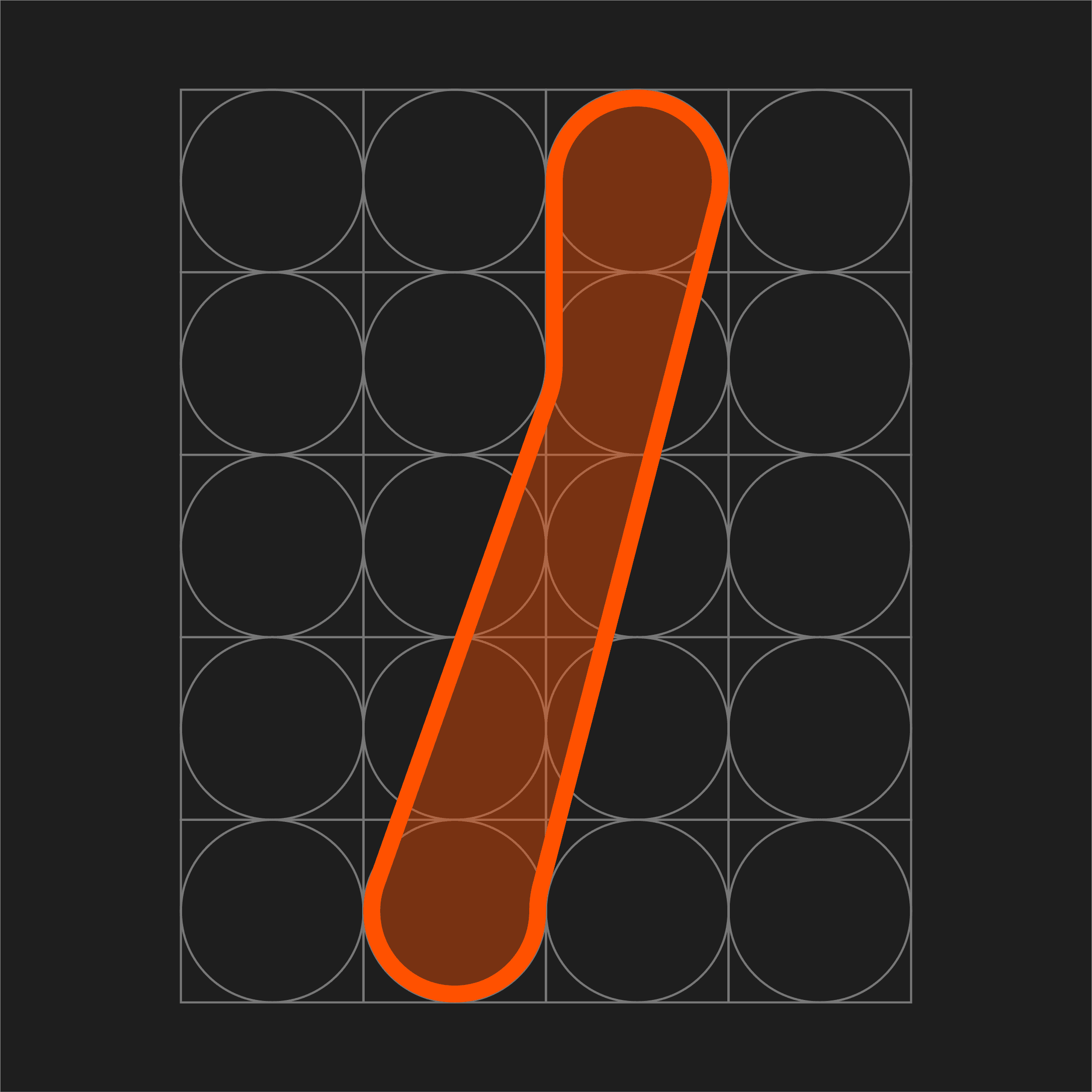
The project began with a circular grid that acted as the base for all letterforms. Since the grid was heavily curved, the challenge was to break out of that softness by introducing straight lines and sharp angles, and finding a balance between the two.
I explored how much I could push the contrast between curves and rigid forms without losing consistency across the typeface. The aim was to build a system where each letter felt like part of the same family, while still having enough character to stand out in bold, expressive compositions.
The idea was to explore how far a simple circular grid could be pushed to create unexpected letterforms. Instead of sticking strictly to the structure, I used the initial iterations to understand its rules; how curves connect, where balance comes from, and what makes the forms readable.
Once that foundation was clear, I started bending those rules by introducing sharper cuts, shifting proportions, and disrupting symmetry in controlled ways. The goal was to create letterforms that feel slightly unpredictable at first glance, but still hold together as a cohesive system.
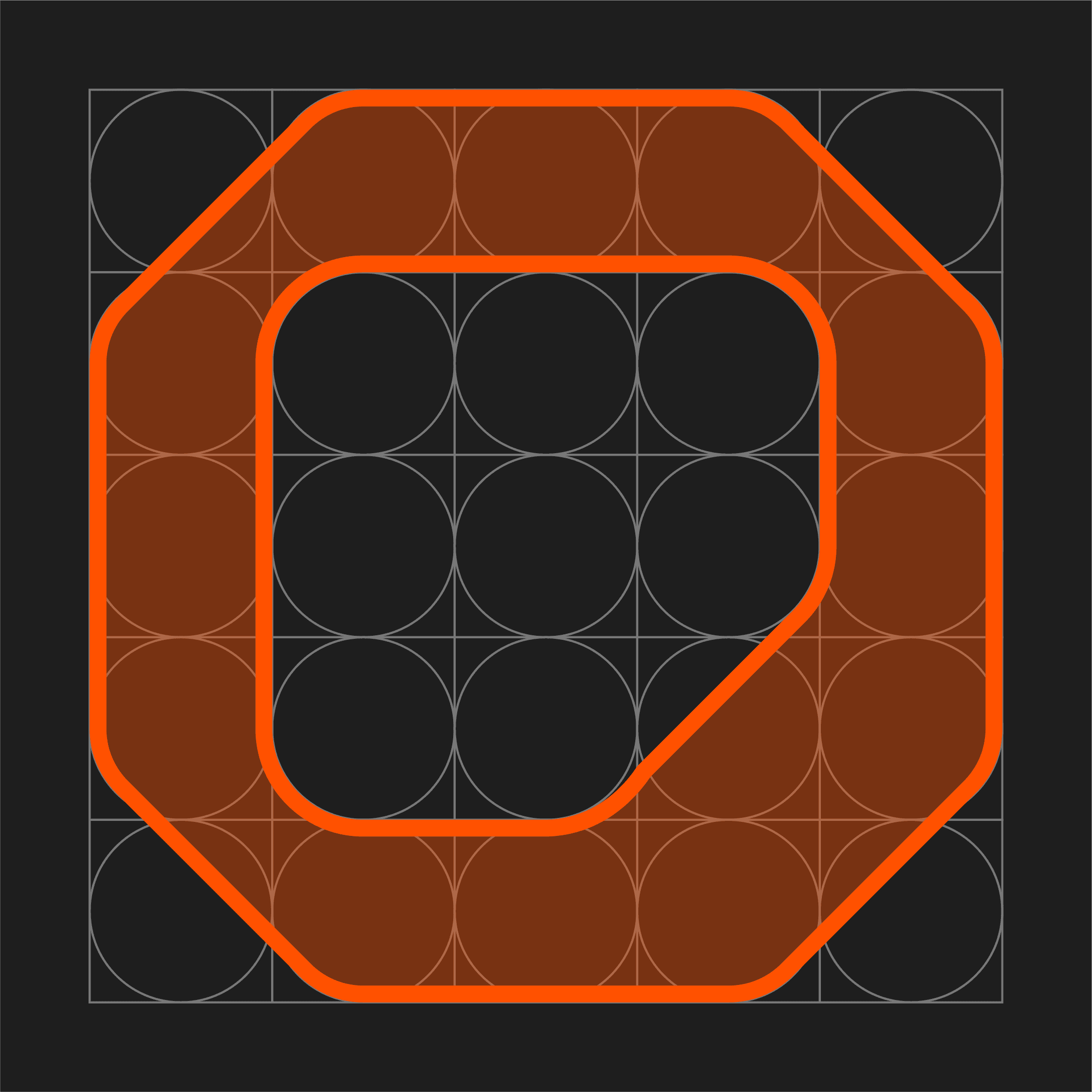
The final typeface has a sharp, forward-moving feel, built on the contrast between rounded strokes and angular cuts. While the circular grid sets the base, most forms push against it through straight edges and clipped curves.
Across the letters, curves are often sliced or flattened, creating a consistent tension between soft and rigid forms. This gives the typeface its dynamic quality while still keeping it visually cohesive.
Brief
Concept and development
Final Design


ORIGIN
TYPE DESIGN
2 WEEKS